For a new version of MC-Timer, I have been looking at reorganising the playback screen, especially the text pointed out here:

Being near the bottom, I don't think people look at this much and combining step values with timing values is probably confusing.
So maybe it will look better when annotated directly over the progress rings? Thankfully SwiftUI makes it easy to experiment with different layouts.

Yes, this helps in the understanding of the values, but I had to drop "Music", "Pause", or "Countdown" which didn't look good when written as a curved text. However, the overall aesthetic suffers tremendously.
So it is probably better to keep the texts in the top corners:
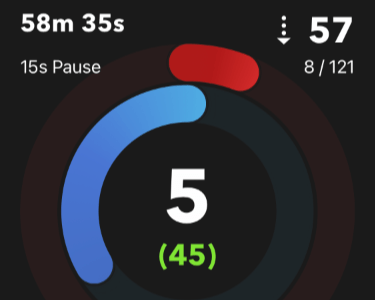
This looks much better and the grouping of the timing values on the left vs. the step values on the right helps also. There is no additional information what the "8 / 121" values mean but it does become apparent whenever the red progress bar increments.
But the wide "15s Pause" text spilling over into the top of the red is not ideal, so I will split that into two lines like this:
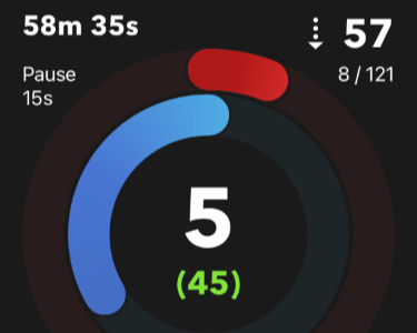
Neat!
 MC-Timer